The biggest challenge we came across was to embed freshness of Art and the goodness of unparalleled culinary experiences through the brand identity. There was also a question of finding the right kind of audience or rather invoke curiosity in any audience to introduce the brand.
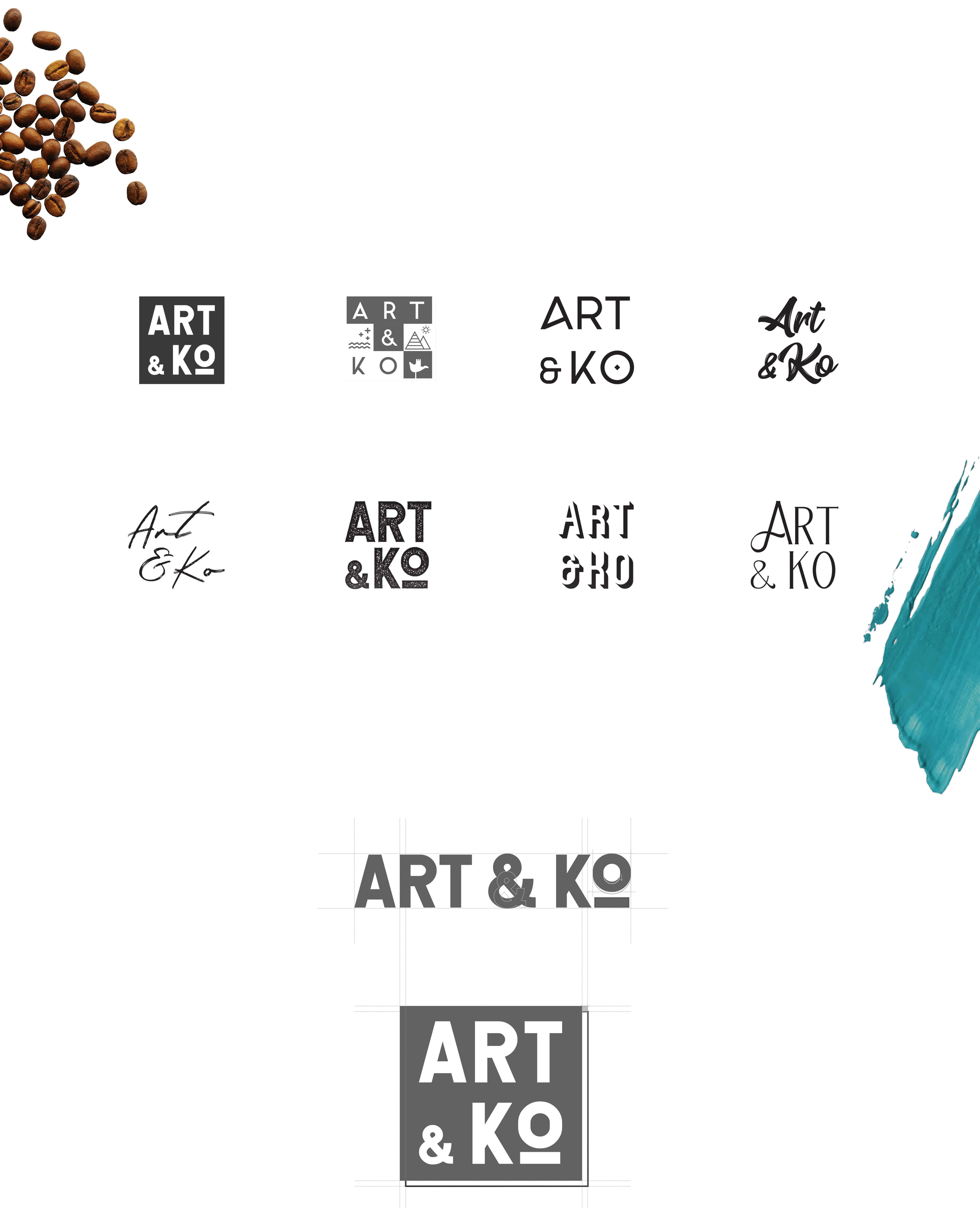
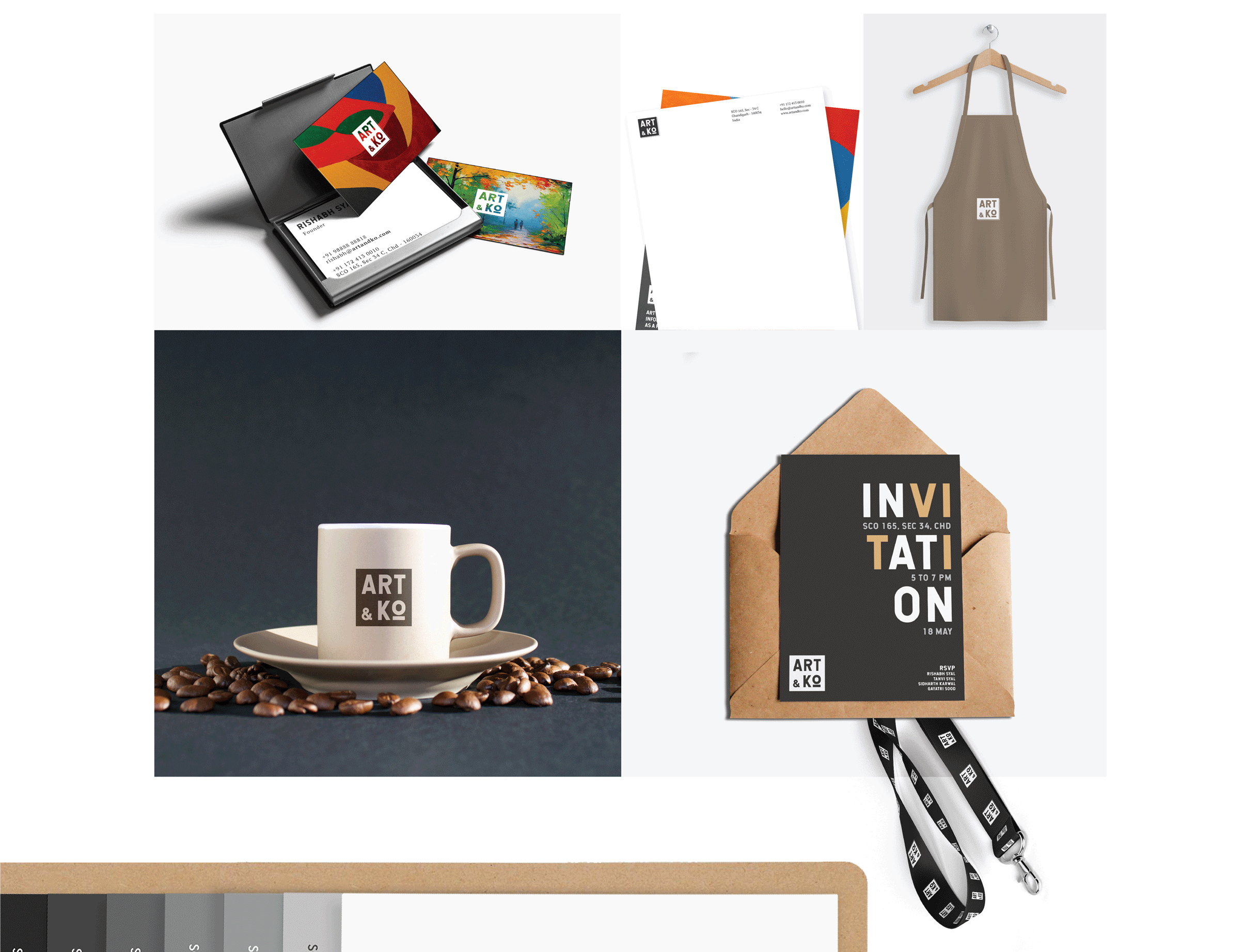
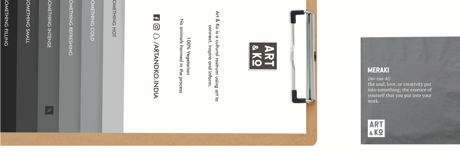
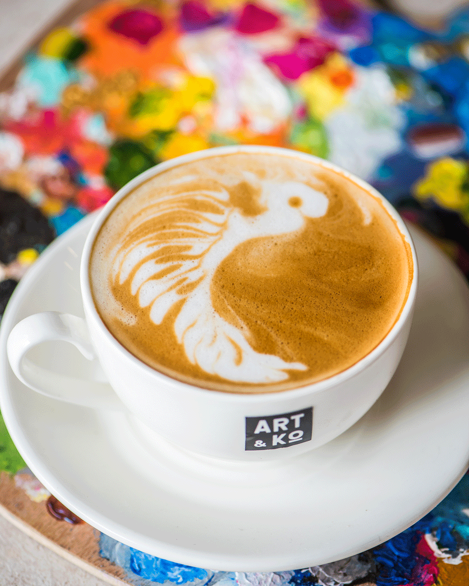
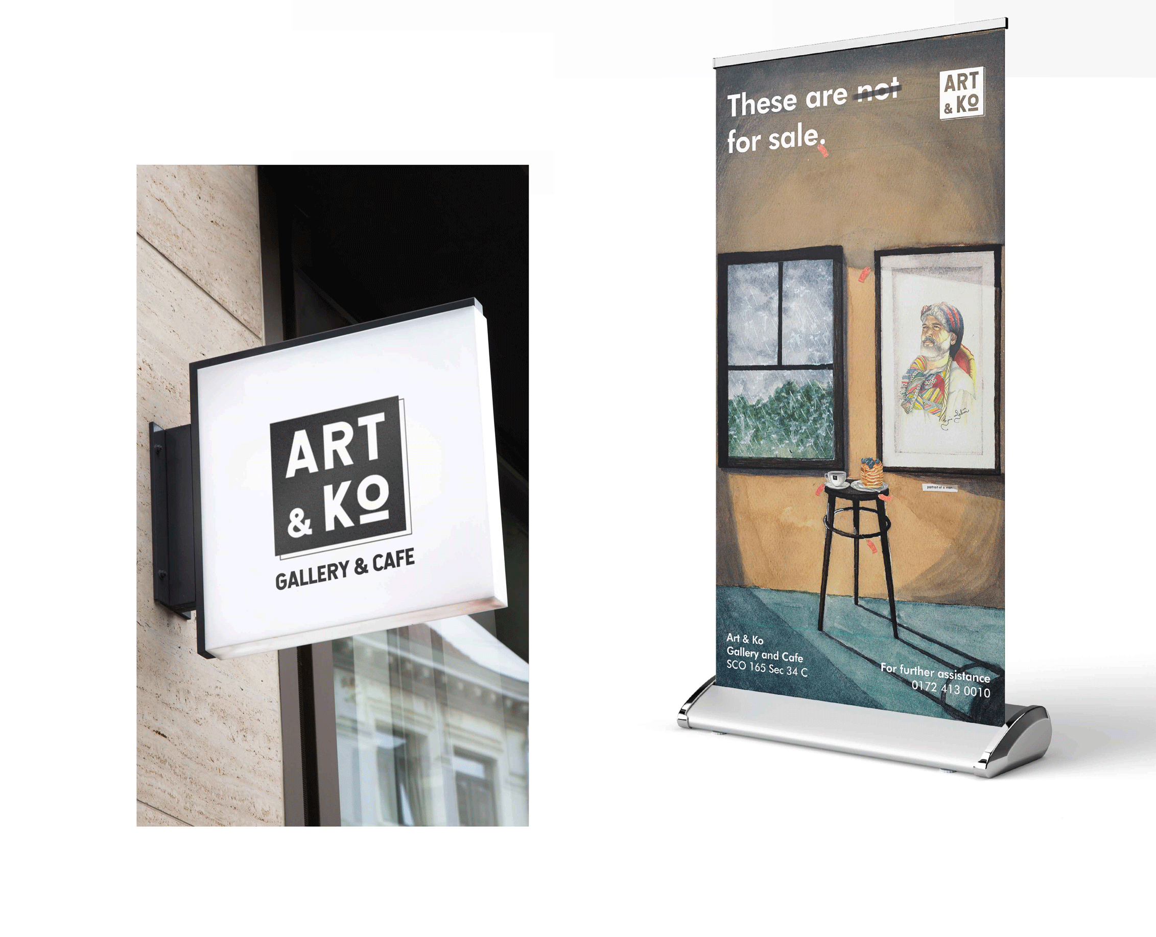
Art & Ko breathes art and sheer eccentricism, and we made sure it is manifested through the designs and identity we used in our branding. The logo, very subtly, resembled a canvas. The bold typography and colour selection express boldness. The little things like shades to colours to the typography collide together to provoke an itch in the audience that has never witnessed something like this before.
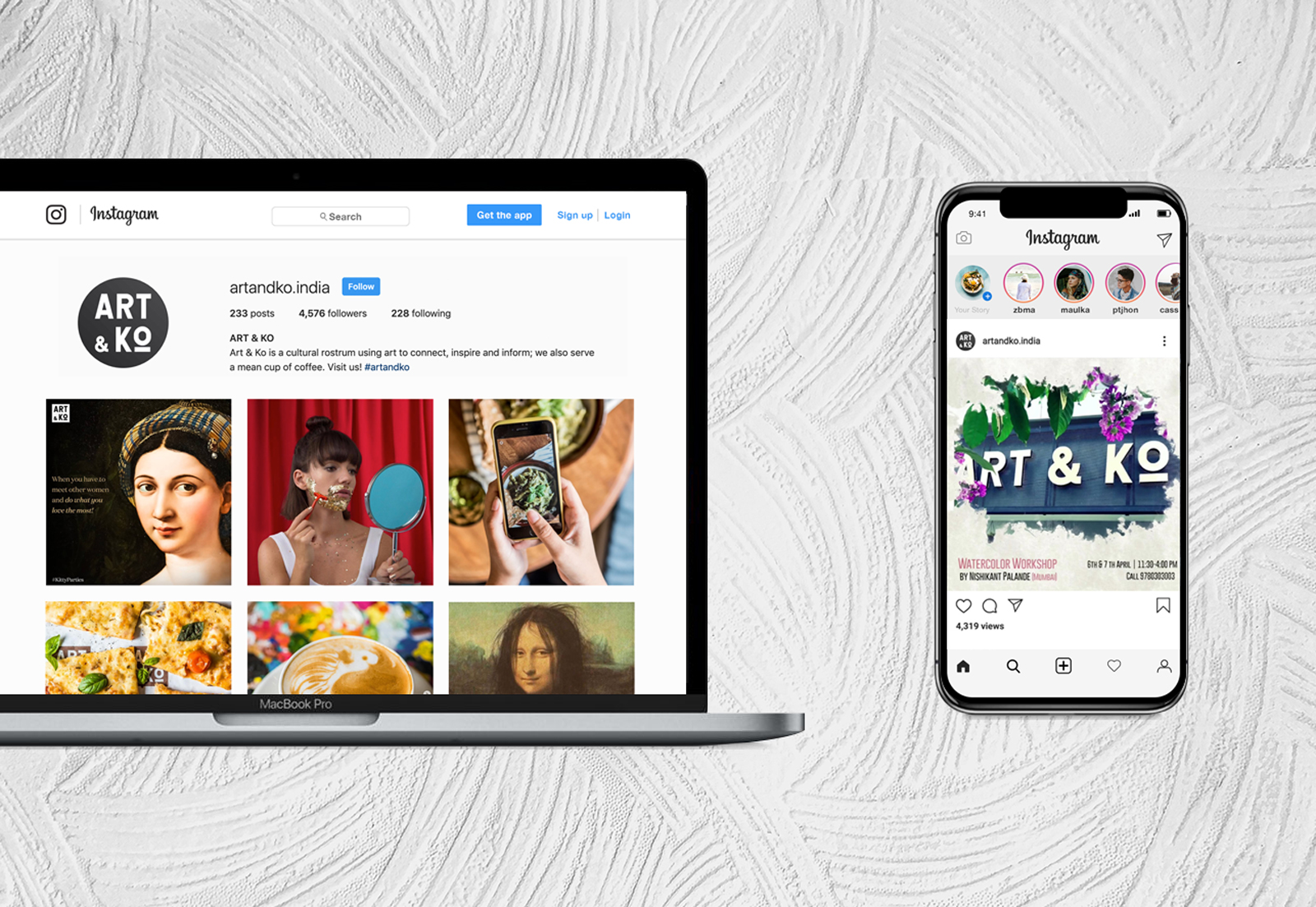
Branding, Print Design, Social Media & Photography
Art & Ko
Art Gallery & Cafe